Design systems are essentially collections of rules, constraints and principles, implemented in design and code. These 3 attributes serve distinct functions and provide coherent, systemic order in systems from buttons to single page applications.
The purpose of design systems are essentially to allow cohesion and coherence across digital properties developed and owned by a brand. The existence of a single source of truth in terms of building blocks that make products like components, colors, fonts, imagery, brand tonality (and more) allows developers and designers to independently build products with minimum assistance while ensuring coherence across properties.
The need within Aditya Birla Capital : One Brand, Multiple Businesses
During late 2017, ABC had relaunched it’s brand as a family of four verticals : Protecting, Investing, Financing and Advising. Each vertical had multiple lines of business and given their through the years, their own brands in the eyes of their respective customers.
While the rebranding exercise built a comprehensive visual communication system for all verticals, there still was a visceral need to standardize all products owned by the Line of Business (LoBs). There were over 20 different products on web, android and iOS platforms under these LoBs.
The presence of all such products drove the need for a comprehensive and living design styleguide for digital products for the LoBs.

Unified Language
A shared language that Product Managers/Owners, Designers & Engineers across Aditya Birla Capital Limited (ABCL) can refer to when explaining objects and processes, thus reducing ambiguity and confusion.

Guidelines
A clear set of guidelines outlining the use of colours, type, imagery, iconography, motion & interaction with the objective of unifying and projecting the Aditya Birla Capital brand across all of its digital properties.

Design
Shared design resources in the form of UI Kits – to quickly create designs & mock-ups that not only accurately reflect the guidelines, but also account for best practices from the fields of User Experience and Human Factors.

Development
Shared code components and development resources to allow engineers to quickly build and re-use. A convenient and scalable way to build.
Over the course of 3 months of intense and focussed activity, Canvs Club translated an exhaustive set of Brand Guidelines into a modern, scalable and reusable Design System along with design assets and development resources to help accelerate the pace of product design and development at Aditya Birla Capital Limited.
Phase 1: Requirement gathering
Gathering requirements from stakeholders across teams at ABCL – such as platforms they use, technologies they rely on, patterns and interactions they currently use and an exhaustive list of issues they face while in the process of doing the above. The process also involved auditing all major ABCL digital properties in production or deployment across Web & Mobile.
In Depth UX Audits
- Interviewing stakeholders to understand and establish business logic, existing tech and design debts, prevailing issues and identifying commonalities across teams and products. Over the course of 7 days, Canvs sat down with multiple teams daily and dived deep into the issues being faced by the teams at the front lines of product development and implementation – from Digital Marketing teams all the way to Development teams.
Stakeholder Interviews
Interviewing stakeholders to understand and establish business logic, existing tech and design debts, prevailing issues and identifying commonalities across teams and products. Over the course of 7 days, Canvs sat down with multiple teams daily and dived deep into the issues being faced by the teams at the front lines of product development and implementation – from Digital Marketing teams all the way to Development teams.
Workshops
We conducted multiple workshops ranging from the foundations and best practices of User Experience Design to the basics of Design Systems and how to use them to accelerate the pace of product development and reduce their Go-To-Market times. With significant help from the central Digital Products team at ABCL, we managed to schedule teams & stakeholders from across the organisation to participate & share their insights.

A team interview in progress

Usability awareness and methods worshop for management
Phase 2: Synthesis

Synthesize insights
Based on the issues we identified we followed up with individual team members on certain teams to hear their personal stories from the front lines. They shared insights with us such as the confusion that stems from the lack of a common vocabulary to the file formats they should work with when engaging with development teams. This allowed us to synthesise insights and identify must-solve issues.
Establish deliverables
Shared design resources in the form of UI Kits – to quickly create designs & mock-ups that not only accurately reflect the guidelines, but also account for best practices from the fields of User Experience and Human Factors.
Identify issues
Basis extensive interviews with teams and stakeholders, we identified issues such as persistent pain points and common issues being faced by most of the teams and individual stakeholders. Ranging from issues such as the permissible use of colors to the lack of guidelines concerning imagery and photography – we identified several common issues being faced across the organization.
Phase 3: Design and Development
Design
Having identified the issues and with an extensive list of design assets and artefacts selected as deliverables, the Design team at Canvs dived into the minutia of designing each and every asset, icon, UI component, interaction element, animation & motion element. From the earliest scribbles to the polished UI elements, we strived towards following best practices wherever applicable and deeply thinking about the paradigms we were establishing.
Development
Meanwhile the Engineering team at Canvs was at work translating the designs coming in from the Design team into semantic, efficient and clean code. The objective through out this process was to ensure the code itself was not just reusable but also flexible enough to allow for modification and easy experimentation. Another hitch in their process was to ensure that the code relied as little as possible on third-party libraries and external packages – using only HTML, CSS & standards compliant JavaScript as much as possible.


The ABC Design System exists as a nuts-and-bolts-included toolkit of Design & Dev resources – designed and engineered for rapid prototyping and deployment.
This allows teams to go from idea to implementation much quicker than if every component and interaction pattern were to be created from scratch.
This has the added benefit of also unifying the look and feel of ABCL digital products – helping project the ‘One Brand for All Your Financial Needs’ philosophy behind Aditya Birla Capital.
As a fully responsive and mobile-native web application – the Wiki that hosts the Design System is accessible from anywhere, using any device, running on any platform – ensuring stakeholders can always refer to and rely upon the resources contained within the System.

Overall Guidelines
A set of rules were laid down to explain to anyone starting off with the design system to understand basic principles and guides to stick to while using it. This established the goals for the design system, general principles for design like usage of images, visual hierarchy, responsiveness/adaptiveness, caching etc. The intention was to keep the guide as a method of execution as well as learning.

Brand guidelines for product
While the key components for marketing communications were set by the Brand team of ABCL, we set out to define brand adaptive guidelines for voice and tone, iconography, grid, typography etc.

Components Handbook
As is customary for any living design styleguide, we designed and developed an extensive component library with Buttons, Text Fields, Tooltips, Accordions, Carousel, Data representations and many more, along with their variations.

Fully Interactive Components with Code
One of the motives behind building this living style guide was to enable the many different dev partners of ABCL and its LoBs to access it for component code snippets as a single source of truth. This allowed cross vertical standardization and completeness of state for all components necessary to build pages.

Wireframes to Establish Common product use cases guidelines.
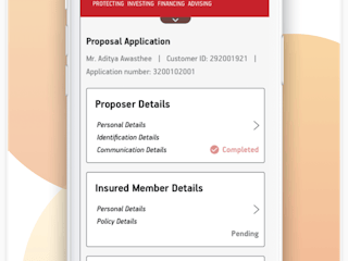
Given the nature of the various businesses involved, certain product components like forms, multi stage onboardings, KYC authentications, navigation etc were a common occurrence across LoBs. This drove the need to establish singular, optimized usability guidelines for all such experiences for all LoBs, so users have a coherent experience irrespective of the entity they are interacting with under ABCL.
iOS and Android Components
Given the nature of the various businesses involved, certain product components like forms, multi stage onboardings, KYC authentications, navigation etc were a common occurence across LoBs. This drove the need to establish singular, optimized usability guidelines for all such experiences for all LoBs, so users have a coherent experience irrespective of which entity they are interactions with under ABCL.
Hear from the users

Karna Singh
Sr. Chief Manager – Product Management & Digital Analytics | Aditya Birla Capital Limited
“Having worked closely with the team at Canvs right from the inception of the project all the way to hand- over and eventual implementation across ABC – I’m happy how the Digital Design System has allowed us to handle systemic UI issues and has also brought improvements in the User Experience across ABC.
The Design System allows digital teams across ABC to ideate on different UX journeys with the convenience of having access to a full library of UI components to piece together like LEGO blocks.
As our digital journey evolves over time, I’m looking forward to the possibilities and affordances it allows to design and deploy digital assets across ABC.”

Joydeep Sanyal
Associate Vice President Marketing | Aditya Birla Sun Life Asset Management
“As a primarily digital business – ABSLAM or ABC Mutual Funds has invested significantly into deploying and scaling digital products. These products range from corporate websites to marketing and campaign driven micro-sites all the way to native & hybrid apps across both major mobile platforms (Android & iOS).
The ABC Design System, or Wiki as we call it internally, has allowed us to accelerate the speed at which ideas can go from inception to production ready. From mocking up simple wireframes to quickly creating new flows or sub- processes, the design assets and development resources contained in the Wiki allow us to move fast and experiment.
In addition it has brought in many small but critical optimizations to existing features and functionalities contributing to an improved user experience across digital products under the aegis of ABSLAM”