A Living Design System for Aditya Birla Capital
Problem Statements
1. One New Brand, Multiple Businesses, Diversely different product experiences
During late 2017, Aditya Birla Capital had relaunched its brand as a family of four verticals : Protecting, Investing, Financing and Advising. Each vertical had multiple lines of businesses and most of these businesses had built reputable, lasting brands for themselves. Additionally, these brands looked fairly different from each other and naturally had varyingly different customer experiences. A fusion exercise like this typically aims at unifying all sub-brands under the same umbrella of principles, culture, customer experiences and brand promise.
It shouldn’t matter which part of the business you are engaging with, the customer should believe she is experiencing the same brand through its impeccable delivery of promised experiences, digital or otherwise.


2. Clear marketing communications guidelines, not so much for Digital yet.
While the rebranding exercise built a comprehensive visual communication system for all verticals establish comprehensive Marketing Communication Guidelines, there wasn’t any definitive digital product guideline created to allow differently-abled and distributed product teams to build cohesive and synchronised digital customer experiences. There were a total of over 20 different major products on the web, android and iOS platforms owned by the 11 different Lines of Businesses that ABC was unifying under one brand Aditya Birla Capital. The products felt different in usage and more often than not, weren’t individually optimised for modern digital experiences.
3. Many Tech Partners, no single source of truth
Across the group ABC’s lines of businesses work with upwards of 25 different development partners on various products, on and off. This perpetuated inconsistencies in user experience standards, with established practices for validations, error states, button states, image usage, typography etc falling through the cracks.
A lack of a standard showed and was that became the need of the hour for various partners to refer from as a single source of truth.
Solving the multi party challenge
Building a Living Design System for 22 Different Products
Clearly, the group needed a unified, standardised rulebook of digital product design to lead them with one guiding beam. They needed a Design System to help them build consistent digital experiences that were stylistically coherent and kept up with the evolving patterns in consumer behaviour and expectations from modern digital ecosystems.

Unified Language
A shared language that Product Managers/Owners, Designers & Engineers across Aditya Birla Capital Limited (ABCL) can refer to when explaining objects and processes, thus reducing ambiguity and confusion..

Guidelines
A clear set of guidelines outlining the use of colours, type, imagery, iconography, motion & interaction with the objective of unifying and projecting the Aditya Birla Capital brand across all of its digital properties.

Design
Shared design resources in the form of UI Kits – to quickly create designs & mock-ups that not only accurately reflect the guidelines, but also account for best practices from the fields of User Experience and Human Factors..

Development
Shared code components and development resources to allow engineers to quickly build and re-use. A convenient and scalable way to build.
The benefits for stakeholders

Product Owners
Faster iterations towards prototyping, research and release. Reproducibility of work. Having prebuilt design components that can be used to build various units and modules right from atomic elements like buttons and textbooks to features like login, contact, Maps etc

Developer Teams
Access to pre coded components that take care of design execution uniformly and consistently across different product. No cross checking for details like color codes, shadows, text hierarchy, error states and validations. Consistency driven by a predefined standard. Code components out of the box.

Business Stakeholders
Faster GTM for product features, adherence to unified brand and continuous adherence to modern digital experience expectations. Additionally reproducibility of components and guides meant significant reduction in third party developer and designer costs.

Execution Team
Multidisciplinary Designers assembled and led by Canvs’ Design Managers
Shared design resources in the form of UI Kits – to quickly create designs & mock-ups that not only accurately reflect the guidelines.
UX Designers
User Experience designers were engaged to understand the needs of the various businesses from their products, understand their consumers and build units that made sense for the consumer. A daunting task for a group with 12 different businesses.
UI Designers and Motion Experts
UI designers and motion designers were brought in to actual build the entire design toolkit of tokens and interactions. They built these components and made sure they converged elegantly when put together on a real screen.
Content Strategists and Documentation Experts
Content strategist were engaged to established the guidelines around product copy, extent of text usage and tonality of voice. Documentation experts were brought in to actually write every thing down so the user of the system doesn’t miss the finer details amidst ambiguity.
Development Team
A dedicate development team was set up to build the code library of al the design tokens and interactions in HTML/CSS/JS such that they can be grabbed and plug in directly into product by other developer teams of the group.
Execution Phases
Phase 1: Requirement Gathering
Gathering requirements from stakeholders across teams at ABCL – such as platforms they use, technologies they rely on, patterns in interactions they exhibit while building products and an exhaustive list of issues they face while in the process of doing the above. The process also involved auditing all major ABCL digital properties in production or deployment across Web & Mobile.
Conducting Stakeholder Interviews
Interviewing stakeholders to understand and establish business logic, existing tech and design debts, prevailing issues and identifying commonalities across teams and products. Over the course of 20 days, Canvs sat down with multiple teams daily and dived deep into the issues being faced by the teams at the front lines of product development and implementation – from Digital Marketing teams all the way to Development teams.
Taking inventory and in-depth UX audits
Canvs’ team procured access to over 20 different mature products from 12 different businesses and understood the various decisions that went into building them the way they were. Additionally, UX audits were done to find patterns in pitfalls in design execution across the board. Finding these patterns illuminated the common areas of design that troubled most teams across the group. They were hence one of the critical problems to solve.
Awareness workshops for product teams
We conducted multiple workshops ranging from the foundations and best practices of User Experience Design to the basics of Design Systems and how to use them to accelerate the pace of product development and reduce their Go-To-Market times. With significant help from the central Digital Products team at ABCL, we managed to schedule teams & stakeholders from across the organisation to participate & share their insights.

Phase 2: Synthesis and Awareness
Having done our extensive groundwork with all the companies under the ABC umbrella and their relevant teams, our next steps were to assess the data and synthesise insights out of it. These learnings helped us to understand the most fundamental requirements from the Design System we were building and everything that has been desired but forgotten due to a lack of expertise or resource strength.
Synthesising insights
Based on the issues we identified we followed up with individual team members on certain teams to hear their personal stories from the front lines. They shared insights with us such as the confusion that stems from the lack of a common vocabulary to the file formats they should work with when engaging with development teams. This allowed us to synthesise insights and identify must-solve issues.
Establishing deliverables
Having understood the rampant problems in taking builds to market we figured out the main outputted of the design system and the most important components it would need to have. For instance common journeys in BFSi like eKYC, signups etc became evidently necessary to optimise and standardize.
Assessment workshops for teams
Basis extensive interviews with teams and stakeholders, we identified issues such as persistent pain points and common issues being faced by most of the teams and individual stakeholders. Ranging from issues such as the permissible use of colors to the lack of guidelines concerning imagery and photography – we identified several common issues being faced across the organization.
Phase 3: Design and Development
Gathering requirements from stakeholders across teams at ABCL – such as platforms they use, technologies they rely on, patterns in interactions they exhibit while building products and an exhaustive list of issues they face while in the process of doing the above. The process also involved auditing all major ABCL digital properties in production or deployment across Web & Mobile.
Design
Having identified the issues and with an extensive list of design assets and artefacts selected as deliverables, the Design team at Canvs dived into the minutia of designing each and every asset, icon, UI component, interaction element, animation & motion element. From the earliest scribbles to the polished UI elements, we strived towards following best practices wherever applicable and deeply thinking about the paradigms we were establishing.
Development
Meanwhile the Engineering team at Canvs was at work translating the designs coming in from the Design team into semantic, efficient and clean code. The objective throughout this process was to ensure the code itself was not just reusable but also flexible enough to allow for modification and easy experimentation. Another hitch in their process was to ensure that the code relied as little as possible on third-party libraries and external packages – using only HTML, CSS & standards compliant JavaScript as much as possible.

The ABC Design System
A nuts-and-bolts-included toolkit of Design & Dev resources – designed and engineered for rapid prototyping and deployment.
This product to make products allowed teams to bolt from idea to implementation much quicker than ever. Half the job was always ready to pick from.
It had the added benefit of also unifying the look and feel of ABC’s digital products – helping project the ‘One Brand for All Your Financial Needs’ philosophy behind Aditya Birla Capital.
As a fully responsive and mobile-native web application – the Wiki that hosted the Design System is currently accessible from anywhere, using any device, running on any platform – ensuring stakeholders can always refer to and rely upon the resources contained within the System.


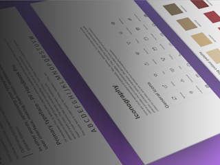
1. Digital Design Principles
A set of rules were laid down to explain to anyone starting off with the design system to understand basic principles and guides to stick to while using it. This established the goals for the design system, general principles in design like the simplicity of tone, accessibility guidelines, cross-platform presence, visual hierarchy of elements, load times etc
The aim was to build a system that didn’t just allow to build but also learn alongside the process.
2. Interpretation of the Brand in the Digital Space
The system fulfilled the promise to adapt the existing new brand onto its digital products.
How that translated were visible in the use of typography, proprietary images, icon styles, tone of voice, grid systems, color palette usage, support touchpoints, customer education etc.


3. Design Component Handbook
As is customary for any living design styleguide, we designed and developed an extensive component library with Buttons, Text Fields, Tooltips, Accordions, Carousel, Data representations and many more, along with their interactive variations.
4. Interactive Component Code Library
One of the motives behind building this living style guide was to enable the many different dev partners of ABCL and its LoBs to access it for component code snippets as a single source of truth. This allowed cross vertical standardisation and completeness of state for all components necessary to build pages.


5. Overall Usage Documentation
A major part of tying together all the rules, guides and constraints towards a coherent book of truth is actually writing all that down in the simplest possible format so the users of the system don’t need assistance while accessing the System.
In our case, the users were going to be a lot of developer teams with diverse background and product teams with various depths in product and design understanding. That made it plenty clear that the documentation needed to be crisp, non-technical (as far as possible) and non-ambiguous.
6. Design standardisations for common use cases
Given the nature of the various businesses involved, certain product components like forms, multi-stage onboardings, KYC authentications, navigation etc were a common occurrence across LoBs. This drove the need to establish singular, optimized usability guidelines for all such experiences for all LoBs, so users have a coherent experience irrespective of the entity they are interacting with, under ABCL.
7. Cross platform compatibility
The design system was built for web, android and iOS platforms. Since some of the teams within the group deployed their apps as hybrid products on Cordova, we made sure they were heard when the system was being built.
Implementation and Handholding
Demonstrating the System and designing experiences using them.
Having created the Design System, we demonstrated best practices on actual pages to show how design standards can be maintained using components off the System.
We redesigned the dashboard and landing experiences for major lines of businesses to assist them through the implementation of the systems and its guidelines keeping in mind standard modern user experience guidelines and the business needs.
Demonstrating design processes using the system
Most lines of businesses within ABCL frequently built and pushed landing pages for campaigns, new products, support etc. While the system gave them all the building blocks to build them we realised it’s actually critical to show examples of real usage of the system on full pages going well beyond widgets like signup, contact etc.
It’s easy for a product’s design to go wrong if a team can’t simply apply the system in their work. Hence some basic guard-rails were important to execute as examples.
Establishing a continuity plan for businesses
Expecting consistency in user experiences implied ensuring best practices on actually journeys and customer touch-points across the board.
We worked with the group’s brand team to execute well thought out experiences which served as guidelines for the respective businesses.
To make that happen we did additional interviews with all stakeholders across the LoBs and understood their business specific requirements from them.

Reception from stakeholders
Users from ABC have found this as a definitively innovative step in the lives of their products. Product owners could now concentrate on UX strategy and developers could start projects halfway done already.

“As a primarily digital business – ABSLAM or ABC Mutual Funds has invested significantly into deploying and scaling digital products. These products range from corporate websites to marketing and campaign-driven micro-sites all the way to native & hybrid apps across both major mobile platforms (Android & iOS).
The ABC Design System, or Wiki as we call it internally, has allowed us to accelerate the speed at which ideas can go from inception to production-ready. From mocking up simple wireframes to quickly creating new flows or sub-processes, the design assets and development resources contained in the Wiki allow us to move fast and experiment.
In addition, it has brought in many small but critical optimizations to existing features and functionalities contributing to an improved user experience across digital products under the aegis of ABSLAM”
Joydeep Sanyal
AVP Marketing | Aditya Birla Sun Life Asset Management

“Having worked closely with the team at Canvs right from the inception of the project all the way to hand- over and eventual implementation across ABC – I’m happy how the Digital Design System has allowed us to handle systemic UI issues and has also brought improvements in the User Experience across ABC.
The Design System allows digital teams across ABC to ideate on different UX journeys with the convenience of having access to a full library of UI components to piece together like LEGO blocks.
As our digital journey evolves over time, I’m looking forward to the possibilities and affordances it allows to design and deploy digital assets across ABC.”