Case: ICICI Innovation Labs approached Canvs to redesign and restructure their Customer Conversation Platform (CCP) to allow for quicker information capture, reduced friction and streamline the overall flow.
Project and its context
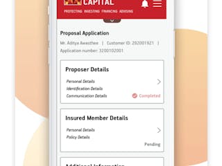
ICICI Innovation Labs is a subsidiary of ICICI Bank, which is a leading private sector bank in India offering Netbanking services & Personal banking services like Accounts & Deposits, Cards, Loans, Insurance etc. CCP is a platform used by ICICI Bank as an information capture module to be used by RM(Relationship Manager) while communicating with the customer overcall. Based on the inputs gathered, different customized financial product offerings are suggested. This could in turn evolve into a Customer Management & Sales platform.
Some primary objectives that we focussed on to deliver the best experience were:
– Low Error Rates
– Ubiquitous Understandability
– Intuitive Structure
Solving for the challenges

How we went about solving the problem
We went about visualizing the CCP module as a combination of 5 basic utilities to have a more refined and contextual approach to the problem at hand. The utilities were:
UX writing on the platform was made more precise and customized to make it more directed and assistive for the RM during the conversation. The better the experience, the better the response rates, retention, and conversion.
Conversation prompts were italicised within quotes to make it clear and easy for the RMs to scan and deliver.
Chunking of form fields into parts with clear and distinct “next and previous” action buttons ensured the user can easily access the previous and next steps and remain in control of the flow.
")
Options in form fields were redesigned to have minimum abstraction wherever possible. Usage of dropdowns was limited to entries with say 6 or more options. For single answer options, the same was listed with a radio button instead of dropdowns. This reduces unnecessary clicks and cognitive load for the RMs thereby maximizing their attention with customer conversations.
In addition, the free-flowing text entry fields were replaced with a list of items that can be predefined basis historical information on the type of feedback generally received by Relationship Managers (Ex: Feedback entry fields). This helps create a more organised set of feedback data that will be easier to analyse and also speed up the process of information capture.

Pinboards as an entity house all pins or tags that can be selected by the RM based on the conversation with the customer. Basis the pins selected, the Product list is populated to have custom products tailored to customer needs. Since this was a vital part of the flow, we decided to anchor it with a fixed position in the layout to make it easier for the RM to interact.
Pins are also a point of constant engagement throughout the flow and hence we ensure to make the individual pins prominent in size and also better arranged (alphabetically) for easier predictability.
Pinboard was also accommodated to have an ‘Undo’ pin selection option to be able to handle erroneous/stray clicks.

Based on customer answers and pinboard selections made, the product listing page has customized products listed down for the customer. This is based on STACK- which is an internal categorization of product offerings by ICICI to provide custom digital & instant solutions across the customer’s relationship journey with ICICI.
Since product listing was an integral part of the entire journey and acted as a supplement to the Conversation points, warranted a fixed position in the layout. This allowed for a better context and value addition to the RMs while steering the conversation with customers.
Each product in the Product Listing was redesigned to have the additional context to add value proposition. Hence, each product in the Products panel had product cards with basic details to act as a cue for the RM and quick action buttons to aid faster decision making.
Subtle colour flushes to product categories allowing for visual attention whenever a new product is populated in the list.

To allow for free-flowing text inputs if needed by the RM, over and above the information collected through the module, a dedicated Notepad section handled this use case. This section was used to further refine the Pinboard section to accommodate any missing categories.

Results
We wanted to make the entire flow as smooth and predictable as possible for the RMs which could thereby enable them to focus on customer conversations to bring out insights valuable to the business. With a utility focussed approach, we were able to transform the product to have quick turnarounds, easy understandability and hyper linear experience with a decent amount of customizability.
Case: ICICI Innovation Labs approached Canvs to redesign and restructure their Customer Conversation Platform (CCP) to allow for quicker information capture, reduced friction and streamline the overall flow.
Project and its context
ICICI Innovation Labs is a subsidiary of ICICI Bank, which is a leading private sector bank in India offering Netbanking services & Personal banking services like Accounts & Deposits, Cards, Loans, Insurance etc. CCP is a platform used by ICICI Bank as an information capture module to be used by RM(Relationship Manager) while communicating with the customer overcall. Based on the inputs gathered, different customized financial product offerings are suggested. This could in turn evolve into a Customer Management & Sales platform.
Some primary objectives that we focussed on to deliver the best experience were:
– Low Error Rates
– Ubiquitous Understandability
– Intuitive Structure
Solving for the challenges
How we went about solving the problem
We went about visualizing the CCP module as a combination of 5 basic utilities to have a more refined and contextual approach to the problem at hand. The utilities were:
UX writing on the platform was made more precise and customized to make it more directed and assistive for the RM during the conversation. The better the experience, the better the response rates, retention, and conversion.
Conversation prompts were italicised within quotes to make it clear and easy for the RMs to scan and deliver.
Chunking of form fields into parts with clear and distinct “next and previous” action buttons ensured the user can easily access the previous and next steps and remain in control of the flow.
Options in form fields were redesigned to have minimum abstraction wherever possible. Usage of dropdowns was limited to entries with say 6 or more options. For single answer options, the same was listed with a radio button instead of dropdowns. This reduces unnecessary clicks and cognitive load for the RMs thereby maximizing their attention with customer conversations.
In addition, the free-flowing text entry fields were replaced with a list of items that can be predefined basis historical information on the type of feedback generally received by Relationship Managers (Ex: Feedback entry fields). This helps create a more organised set of feedback data that will be easier to analyse and also speed up the process of information capture.
Pinboards as an entity house all pins or tags that can be selected by the RM based on the conversation with the customer. Basis the pins selected, the Product list is populated to have custom products tailored to customer needs. Since this was a vital part of the flow, we decided to anchor it with a fixed position in the layout to make it easier for the RM to interact.
Pins are also a point of constant engagement throughout the flow and hence we ensure to make the individual pins prominent in size and also better arranged (alphabetically) for easier predictability.
Pinboard was also accommodated to have an ‘Undo’ pin selection option to be able to handle erroneous/stray clicks.
Based on customer answers and pinboard selections made, the product listing page has customized products listed down for the customer. This is based on STACK- which is an internal categorization of product offerings by ICICI to provide custom digital & instant solutions across the customer’s relationship journey with ICICI.
Since product listing was an integral part of the entire journey and acted as a supplement to the Conversation points, warranted a fixed position in the layout. This allowed for a better context and value addition to the RMs while steering the conversation with customers.
Each product in the Product Listing was redesigned to have the additional context to add value proposition. Hence, each product in the Products panel had product cards with basic details to act as a cue for the RM and quick action buttons to aid faster decision making.
Subtle colour flushes to product categories allowing for visual attention whenever a new product is populated in the list.
To allow for free-flowing text inputs if needed by the RM, over and above the information collected through the module, a dedicated Notepad section handled this use case. This section was used to further refine the Pinboard section to accommodate any missing categories.
Results
We wanted to make the entire flow as smooth and predictable as possible for the RMs which could thereby enable them to focus on customer conversations to bring out insights valuable to the business. With a utility focussed approach, we were able to transform the product to have quick turnarounds, easy understandability and hyper linear experience with a decent amount of customizability.