

Fixing Wolfy’s Point of Sale (PoS) product with Access.

🇺🇸 Redwood City, California U.S.
🌎 wolfy.menu
Wolfy’s PoS product was being tested by it’s paying customers, the restaurants and hence it was owed its due in design upgradation both in terms of usability and visuals.

BACKGROUND
A PoS paired with a digital Menu as a proof of concept.
Wolfy is SaaS offering which helps individual restaurants set up their own online mobile menu accessible via Table top QR codes thus doing away with the need to have paper/physical menu cards. Naturally, Wolfy has a Customer facing side (Menu) and a restaurant facing side (PoS)
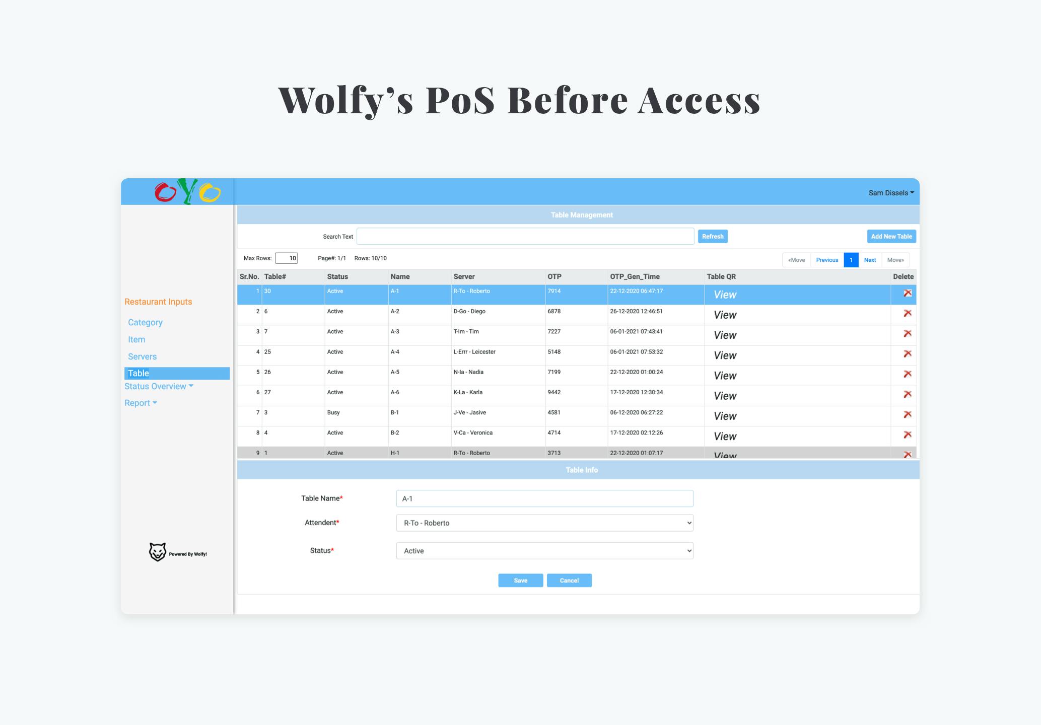
The PoS involves handling the orders from diners, managing tables, setting up menu items, categories and their respective customizations, generating reports based on historical data, maintaining server data, tips and so on.
The PoS involves handling the orders from diners, managing tables, setting up menu items, categories and their respective customizations, generating reports based on historical data, maintaining server data, tips and so on.

Built without design support, an MVP with some rough edges.
Wolfy’s PoS had design problems involving architecture, copy, visuals and usability. We took stock of the situation before diving to solve them.
THE ENGAGEMENT
Finding the building blocks and improving them
While inspecting the product, we identified the various components that propagate themselves to make the bulk of the product. Revamping the components would automatically cover a lot of ground and become a general solution across pages.


Going beyond components with directions to build
The next step was to tidy up some of the existing structures like a modal here, a header there to establish how the new components with the correct guidelines work together to actual build product components.


Behind the scenes: Explanations and rationales
While making changes we made sure we dropped a good number of notes so the team could follow along and understand the fundamentals being applied.


Ensuring executability and continuity
To align closely with the developers and make sure they implement changes without having any doubts we handed over the components over zeplin. Further, we provided a continuity plan so that the team can execute product modules after we are gone and they stay within the guard rails we set up.


Fixing Wolfy’s Point of Sale (PoS) product with Access.
Wolfy’s PoS product was being tested by it’s paying customers, the restaurants and hence it was owed its due in design upgradation both in terms of usability and visuals.
🇺🇸 Redwood City, California U.S.
🌎 wolfy.menu

BACKGROUND
A PoS paired with a digital Menu as a proof of concept.
Wolfy is SaaS offering which helps individual restaurants set up their own online mobile menu accessible via Table top QR codes thus doing away with the need to have paper/physical menu cards. Naturally, Wolfy has a Customer facing side (Menu) and a restaurant facing side (PoS)
The PoS involves handling the orders from diners, managing tables, setting up menu items, categories and their respective customizations, generating reports based on historical data, maintaining server data, tips and so on.
Built without design support, an MVP with some rough edges.
Wolfy’s PoS had design problems involving architecture, copy, visuals and usability. We took stock of the situation before diving to solve them.
THE ENGAGEMENT
To impact maximally we went after the building blocks
While inspecting the product, we identified the various components that propagate themselves to make the bulk of the product. Revamping the components would automatically cover a lot of ground and become a general solution across pages.
And then we redesigned some structures from them.
The next step was to tidy up some of the existing structures like a modal here, a header there to establish how the new components with the correct guidelines work together to actual build product components.
Explanations and rationales behind the scene
While making changes we made sure we dropped a good number of notes so the team could follow along and understand the fundamentals being applied.
Ensuring executability and continuity
Having revamped and fixed the product usability and visuals, we made sure we left Wolfy with a continuity plan so that they can execute product modules after we are gone and keep them within the guard rails we set up.

