Aditya Birla Sun Life Insurance
Extensive form-based full policy purchase journeys for 4 Life Insurance Products
The products under consideration were: DigiShield, Secure Plus, Cancer Shield, Vision Star.
Challenges
Solutions
Execution
Two primary tasks were performed within the first day of the project :
– We broke down the entire project into a methodical, time contained, review friendly execution pipeline that ended 28 days from execution.
– We set up 2 different teams headed by 1 Senior Designer to ensure consistency, quality and execution timelines. The 2 teams had one UX and one UI professional each.
")
Digital Adaptation
In order to adapt extensive offline modules into new online modules, Canvs sat with Business teams, Marketing teams, External Consultants (BCG), Tech and Regulatory bodies to bring together all constraints which were at play.
This released a lot of new pathways which were otherwise not apparent looking at physical form units. While business and marketing teams enlightened our product managers about the various assumptions about form filling in Insurance that could be safely held, legal teams guarded the whole exercise to make sure the design was well within regulatory constraints.

Discussing a few solutions
1. The Premium Page
The premium page had the task of displaying all the relevant information a user must know before embarking on a purchase journey. The base construct of a life insurance plan was also necessary to be self-explanatory from the UI.

2. Pre-Payment Proposer Details
One of the larger problems faced by the business was the process of payment for a new customer given the length of these forms. Canvs spoke with the legal teams at ABSLI to understand the exact basic details necessary to receive a payment from a user and then allow her to proceed with the rest of the journey. This was expected to increase the propensity of a user to complete the purchase funnel.
Progressive Disclosure
The Pre payment steps were further broken down into steps depending on what a user needs to see at a particular point of time. This allows users to focus on the task at hand and reduce visual overload.

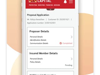
3. Post-Payment Proposal Form
Given the length of the life insurance forms, one of the largest challenges at hand was expectation management for the user. Our hypothesis was, in order to allow the user to know how much of the process is currently finished we shall need to break the process down into steps and sub-steps.
Hybrid Hub-Nesting Model
The right section of the form was devised into a set of subsets that the user is finishing up as she goes. This allows the user to jump back and forth between sections, know how much of what section is left and gauge her time commitment according to her priorities.

4. Complete Mobile Friendliness
An important part of this design process was to make the forms mobile-friendly to reduce the drop-offs before payment and reduce filling time for all 4 products being offered.


Aditya Birla Sun Life Insurance
Extensive form-based full policy purchase journeys for 4 Life Insurance Products
The products under consideration were: DigiShield, Secure Plus, Cancer Shield, Vision Star.
Challenges
Solution
Execution
Digital Adaptation
Discussing a few solutions
1. The Premium Page
2. Pre-Payment Proposer Details
Canvs spoke with the legal teams at ABSLI to understand the exact basic details necessary to receive a payment from a user and then allow her to proceed with the rest of the journey. This was expected to increase the propensity of a user to complete the purchase funnel.
3. Post-Payment Proposal Form
4. Complete Mobile Friendliness