

Nebory: Hyperlocal Neighborhood App

In a world where social distancing is becoming the norm, make sure that you are not socially isolated and remain in touch with your neighbours with the all-new Nebory app.
Available on Google Play Store and Apple App Store
")
BACKGROUND
A platform to connect neighbours and local businesses
Nebory is a platform designed for users to get to know their neighbours, solve community issues amicably, take collective decisions, discover local events. The essential idea of the platform is to help get users digitally in touch with their hyperlocal realities, be it local news, classifieds or marketplace offerings.
Built and designed by the founders themselves, the product required an overhaul from the user experience and interface perspective to provide a stylisation and format that gave the Nebory platform a unique and contemporary look while improving the overall usability/readability of the platform.
THE ENGAGEMENT
To impact maximally we focussed on the building blocks
The primary focus for the ACCESS team was to approach this platform from an atomic and modular approach to improve:
1. User generated content reading and posting
2. Improved marketplace exploration and transactions
1. User generated content reading and posting
2. Improved marketplace exploration and transactions
On a platform that is centred around content cards in different formats (Content, Classifieds, News and Marketplace) the idea was to solve the fundamental building blocks of the platform after which layouts were brought together.
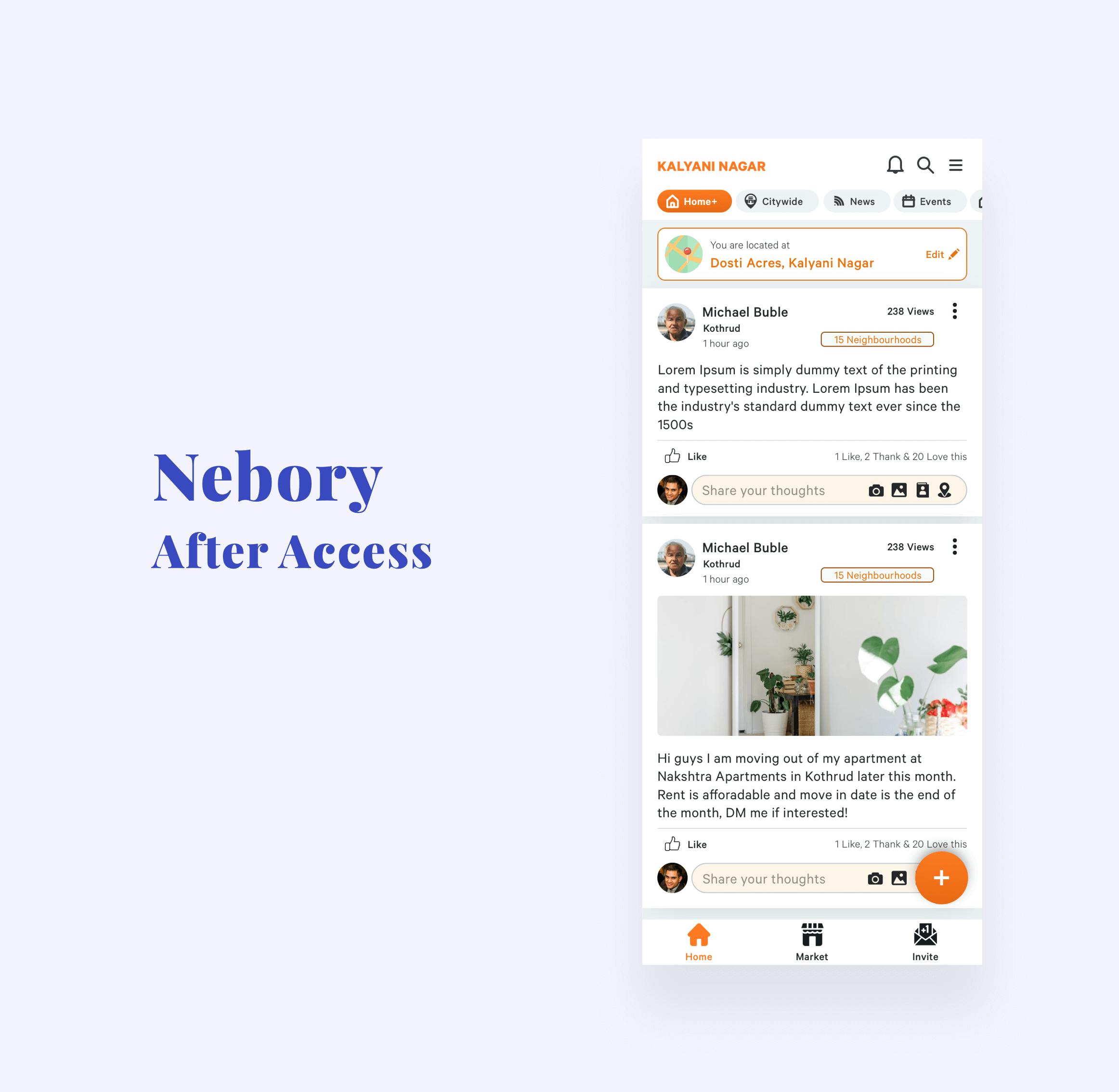
Designing containers using an Atomic/Molecular approach
A notable feature across containers in the app is that regardless of them being designed for different purposes, they all shared similar micro-elements or “molecules” like a profile marker or reactions buttons/comments section which need to be designed consistently to deliver a predictable read.
Not only does this help in quicker scanning and reading pace for the user but also does this create a more neat design paired with the contemporary look and feel that we created for this platform.
")
Employing a Cleaner Content Structure & Display
Considering how the platform has multiple content containers, it was important to make sure all of them had a clear, standard and focused internal structuring for easy reading. Besides making sure containers are clear and consistent across the board, the content was also given a fair amount of provisional space (such as in the image shown) in order to prevent breaks in the design in the case of large amounts of content by providing the developers with a fixed guide for their content guidelines.
")
Introducing Navigational Alterations
The top and bottom navigations were cleaned up, both for item positioning and styling in order to make choice making easier for users. To add to this, a revamp of the bottom nav allowed for improved focus on the Marketplace option, an important section from a business standpoint.
")
")
Implementing Best Practices
Where UX flows were following intro traps of being dated, or simply non-intuitive, we applied the best practices known for their respective modules. Notice in the image example for the News module how we created a more engaging first-fold, by employing different size news cards for the fold, thus improving reader interest and retention along with providing more content for the user consume in one screen.
Example 1: Nebory’s news section post restructuring and revisualization
This was employed in the News section by creating an opening space where the user can pick between a few sets of content by using a carousel: this creates an “open sandbox” effect where they feel like they are provided an array of options to pick from.
")
Example 2: Recreating a shorter signup flow.
A set of changes were applied to forms, particularly the signup process, where we recommended cutting down the number of redundant steps to the bare minimum while using best practices such as step indicators and progressive disclosure in the inputs, essentially a 6 step onboarding was cut down to three steps.
")
TAKEAWAYS
Ensuring executability and continuity
From start to finish, utmost care was taken in having a clear set of documentation through the entire process. This was done so that the developers and client at large were left with a set of actionable and referrable content for future decisions, both developer and design-centric. Dev handover on Zeplin of the redesigned screens, style guides and iconography along with ancillary resources such as animation & illustration recommendations were provided in the final stage.
")
")
Having revamped and fixed the product usability and visuals, we made sure we left Nebory with a continuity plan so that they can execute product modules after we are gone and keep them within the guard rails we set up.
")
")


")
BACKGROUND
A platform to connect neighbours and local businesses
Nebory is a platform designed for users to get to know their neighbours, solve community issues amicably, take collective decisions, discover local events. The essential idea of the platform is to help get users digitally in touch with their hyperlocal realities, be it local news, classifieds or marketplace offerings.
Built and designed by the founders themselves, the product required an overhaul from the user experience and interface perspective to provide a stylisation and format that gave the Nebory platform a unique and contemporary look while improving the overall usability/readability of the platform.
Built and designed by the founders themselves, the product required an overhaul from the user experience and interface perspective to provide a stylisation and format that gave the Nebory platform a unique and contemporary look while improving the overall usability/readability of the platform.
THE ENGAGEMENT
To impact maximally we focussed on the building blocks
The primary focus for the ACCESS team was to approach this platform from an atomic and modular approach to improve:
1. User generated content reading and posting and
2. Improved marketplace exploration and transactions
1. User generated content reading and posting and
2. Improved marketplace exploration and transactions
On a platform that is centred around content cards in different formats (Content, Classifieds, News and Marketplace) the idea was to solve the fundamental building blocks of the platform after which layouts were brought together.
Designing containers using an Atomic/Molecular approach
A notable feature across containers in the app is that regardless of them being designed for different purposes, they all shared similar micro-elements or “molecules” like a profile marker or reactions buttons/comments section which need to be designed consistently to deliver a predictable read.
Not only does this help in quicker scanning and reading pace for the user but also does this create a more neat design paired with the contemporary look and feel that we created for this platform.


")
Introducing Navigational Alterations
The top and bottom navigations were cleaned up, both for item positioning and styling in order to make choice making easier for users. To add to this, a revamp of the bottom nav allowed for improved focus on the Marketplace option, an important section from a business standpoint.
Implementing Best Practices
Where UX flows were following intro traps of being dated, or simply non-intuitive, we applied the best practices known for their respective modules. Notice in the image example for the News module how we created a more engaging first-fold, by employing different size news cards for the fold, thus improving reader interest and retention along with providing more content for the user consume in one screen.
Example 1: Nebory’s news section post restructuring and revisualization
This was employed in the News section by creating an opening space where the user can pick between a few sets of content by using a carousel: this creates an “open sandbox” effect where they feel like they are provided an array of options to pick from.
")
")
Example 2: Recreating a shorter signup flow.
A set of changes were applied to forms, particularly the signup process, where we recommended cutting down the number of redundant steps to the bare minimum while using best practices such as step indicators and progressive disclosure in the inputs, essentially a 6 step onboarding was cut down to three steps.
EXECUTION
Ensuring executability and continuity
From start to finish, utmost care was taken in having a clear set of documentation throughout the entire process. This was done so that the developers and client at large were left with a set of actionable and referrable content for future decisions, both developer and design-centric. Dev handover on Zeplin of the redesigned screens, style guides and iconography along with ancillary resources such as animation & illustration recommendations were provided in the final stage.
Having revamped and fixed the product usability and visuals, we made sure we left Nebory with a continuity plan so that they can execute product modules after we are gone and keep them within the guard rails we set up.